I build things, write the code for them, & run from the resulting explosion.
Engineer · Speaker · Guitarist
No. 01·Introduction
A short bio.
The longer story is below — the short one is on the cover.
Right now I'm a Forward Deployed Engineer at Quarterzip AI, where we build customer onboarding and activation software for B2B teams. Before that I was at Redactive AI working on semantic security for enterprise AI, until Recordpoint acquired the team.
Earlier in my career I was a Cloud Architect at Amazon Web Services, designing public-sector solutions for universities, government, and not-for-profits — and before that a Software Engineer at Localz, building last-mile delivery software for retailers around the world.
I'm a Monash graduate in Electrical Engineering, Computer Science, and Maths. While I was there I ran wired, the IT society, as president in 2017, and helped organise UNIHACK Melbourne — student hackathons across Australia.
Through 2025 I served on the national committee at Young Engineers Australia, after co-chairing the Victorian chapter — both roles spent running events for engineers early in their careers.
Outside work, it's running and bouldering around Melbourne, plus gaming, karate, biking, and tinkering with electronics — at least one of those most days. If you want to see what I've built, my projects are below and my resume is a click away.
When I'm not in front of a screen I'm sometimes in front of a room.
2024
AI
·Product
·Engineering
What we learnt building our AI product
DDD By Night·
Our company built an AI product and released it to customers — an immense undertaking that taught us a lot about taking an idea from prototype to the real world. The technical and business challenges, and how we solved them.
With generative AI tools rapidly integrating into every corner of the enterprise, security risks are evolving faster than ever. As developers, you're on the frontlines of this revolution — tasked with safeguarding sprawling, unstructured data that traditional security methods can't handle.
We'll reveal the hidden vulnerabilities that GenAI exposes — accidental data leaks, misconfigured permissions lurking in knowledge bases — share cutting-edge security strategies, and introduce tools that can fortify your data defenses.
How to Build Ones That Actually Drive Business Value
NDC Sydney·
AI agents are everywhere - but most of them don't work. They drain engineering time, frustrate end users, and burn budgets without ever proving their worth. The result? Shiny demos that impress in the boardroom but fail in production.
This session shows you how to flip that script. I'll share a practical framework for designing and deploying AI agents that create measurable business impact, agents that align with real workflows, integrate securely, and deliver results people actually care about.
If you want to stop wasting resources and start building AI agents that stick, this talk will show you how.
I was scrolling on Linkedin the other day when I came across a sponsored post with a clickbait headline and while this seems like useful advice for setting appropriate retry limits it doesn't address the main issue which is recursion is bad - especially in the cloud. View this on the blog → This got me thinking about Lambda best practices and how functions in the cloud should be used. I think due to a general lack of education and "vibe coding" mentality people have built excessively complicated lambda workflows to solve a myriad of problems. A common example I've seen around are lambda functions that invoke themself in a recursive mess. The issue has only gotten worse over the years, to the point where AWS has even created a custom tool to detect invocation recursion but that still hasn't deterred people from making this common mistake - so I guess it's my turn. View this on the blog → The problem isn’t just theoretical. A quick scan of LinkedIn and X reveals engineers actively promoting recursive patterns in cloud workflows. View this on the blog → I'm not sure why recursion has emerged as valid cloud computing paradigm. I think it has a lot to do with recursion not being properly taught or engineers not having been explained the dangers in using recursion. You absolutely should not write a lambda function that calls itself. Cloud costs make recursive Lambdas a terrible idea. They're slow, inefficient, and expensive. Lambdas are a tool that should be used when you have a short compute processes or asynchronous job (such as uploading files or writing to a database) and the frequency of the job does not warrant a full time compute resource like a container or instance. Recursion is taught in Computer Science/Software Engineering fairly early as a paradigm to solve complicated tasks by reducing the problem with each layer. But as you can see from this example it can be incredibly expensive from a resource perspective to compute an answer using recursion. In this fibonacci code a lambda function essentially does one multiplication operation per invocation1. """ Here's a common example: a factorial function where each multiplication is handled in a new Lambda call—resulting in N invocations for a single result. """ import boto3 import json import os lambda_client = boto3.client('lambda') def lambda_handler(event, context): n = event.get('n', 1) accumulator = event.get('accumulator', 1) if n <= 1: return { 'result': accumulator } # Prepare next payload for recursive call next_event = { 'n': n - 1, 'accumulator': accumulator * n } # Invoke this Lambda function recursively response = lambda_client.invoke( FunctionName=os.environ['AWS_LAMBDA_FUNCTION_NAME'], InvocationType='RequestResponse', Payload=json.dumps(next_event) ) # Read and return the result from the recursive call result_payload = json.load(response['Payload']) return result_payload So why shouldn't lambda functions call other lambda functions? There are two main reasons in my opinion. Since lambda's are charged per invocation and duration the time it takes to invoke and run a function can quickly eat into your budget. Even though you aren't charged for spinning up the lambda if your code is written in such a way that the first lambda has to wait for the second one you will need to pay for that wait time, this is a waste of both time and money. Lambda's should not be responsible for their own execution. If you have to keep the state of the lambda workflow inside a lambda function this will lead to inconsistencies that will break your workflow. Recursive lambdas are also an indication in my opinion of poorly written code and badly defined requirements. Nearly all recursive functions can be transformed to a non recursive form so it's unlikely that what you're trying to do is a fundamentally recursive problem. That being said there are truly recursive operations - however if your code cannot escape using recursion you should be running it in one lambda. This Computerphile video explains one example of a non primate recursive function. View this on the blog → If you need retry logic or some type of loop you should use a step function or SQS queue to handle the state as these systems are designed to handle edge cases much better than your code. I've talked about the power of step functions in the past, in my opinion they are the optimal choice when creating complicated workflows using lambda functions. Hyperscaling - Recursion Goes Wrong Years ago when I worked at AWS one of the new grads had to create a project for their onboarding, as part of the project they created a recursive lambda function that quickly spiralled out of control. If I remember correctly this was before recursion detection but still when Lambda had a invocation limit of 1000 at any given time. This limit was the only thing that stopped the Lambdas from using the entire regions compute resources. The good news for this Cloud Architect was that since this was running in an internal account the actual costs were zero. But if this was an external customer account there was nothing in place to prevent this runaway cost scenario at the time. What people might find really interesting here is how auxiliary services such as KMS, CloudTrail, and CloudWatch take up significant costs as well as the Lambda. This is because by default these services are enabled in a somewhat noisy configuration so when a Lambda function runs it will log activity to CloudWatch, API calls will be logged in CloudTrail, and KMS will be used if there are any encryption keys required. CloudWatch is notorious for cost overruns because most of the time it's free or almost free, but after you pass the free tier limit the costs quickly skyrocket. This little case study is why I will never recommend using a recursive lambda in any context. The dangers are to great and there are better alternatives that can be included in your design. So next time Copilot generates a lambda for you, make sure that it doesn't call itself. Footnotes This is an especially heinous example because the lambda needs to wait for all the nested lambdas to complete before it can return a result. This means that the time the first lambda is running for is the sum of all the nested functions, and the time of the second is the sum of all the below functions and so on. ↩
The only way to offer In-App Purchases on the Apple Mac Store is to use Apple's StoreKit API which provides a complete payment solution for MacOS apps. If you're creating a native app this is fairly straight forward and well documented, however if you're using a third party framework like Flutter or Electron it can get tricky. Fortunately Electron provides first class support for in-app purchases including a tutorial for how to integrate your app with StoreKit, unfortunately the interface between StoreKit and Electron doesn't provide a lot of feedback when things aren't working properly. In this article I'm going to cover some of the challenges and pain points I uncovered trying to get in-app purchases working in my app Touch Typer. But first why am I trying to add in-app purchases? The answer comes from Guideline 3.1.1 - Business - Payments - In-App Purchase of Apple's App Review Guidelines which states that apps must use Apple's payment service to handle any in-app purchases. There are exceptions to this rule, back in 2021 Epic took Apple to court over their walled-garden monopoly and won a sort of compromise where apps can link to other purchase methods, however Apple still takes a cut for facilitating the purchase and will alert the user that the purchase method is not authorized by Apple in a way that looks like a scam warning. So in order to provide the best user experience Apple's in-app purchases are the best way to go. These are the high level steps that we'll follow to get In-App Purchasing working. Create an In-App Purchase item in App Store Connect. Create a draft release and include the in-app purchase as part of the release. Implement the store logic in your app. Build a development version of your Electron app for the Mac App Store. Submit your app to the App Store. Creating Purchase Options in App Store Connect After logging into App Store Connect and selecting your application there should be a sidebar on the left, under Monetization there is an item for In-App Purchases and Subscriptions. From here you can define different subscriptions and purchases which can be made in your app, all purchases and subscriptions are treated the same for our purposes so setting up one will behave exactly like the other. Take note of the PRODUCT ID here as we'll need it later. After you have created the purchase item you can setup a release. IAPs can only be published to users via a new release, similar to how you would update your app. While they look different subscriptions and in-app purchases are the same thing behind the scenes. The only difference is that subscriptions are recurring payments. In the new release you can select from the list of valid in-app purchases and subscriptions. Once the purchase option has been added to the release it will appear in the submission, you can now create test builds of your app and once you're ready you can submit the app for review. Setting up Electron Electron apps have two separate processes, a main and renderer. The main process runs in a node environment and can run privilaged code like writing to the filesystem. The renderer runs inside of a browser environment and is restricted in what it can access. Because of these restrictions it's not possible to directly call the In-App Purchase APIs from a browser window so we'll need to use electrons InterProcess Communication (IPC) library. In you main electron file define the functions you want to expose to the frontend environment. At the very least you probably want a getProducts and purchaseProduct function. import { inAppPurchase } from 'electron/main' app.on('ready', async () => { ipcMain.handle('getProducts', async () => { const products = await inAppPurchase.getProducts() console.log(products) return products }) // This is a good way to test if the app is running in the Mac App Store ipcMain.handle('isMas', () => !!process.mas || process.env['ELECTRON_IS_MAS']) ipcMain.handle( 'purchaseProduct', (event, productIdentifier: string, quantity: number) => { console.log(`Purchasing ${productIdentifier}...`) console.log(`Quantity: ${quantity}`) console.log(`Event: ${event}`) return inAppPurchase.purchaseProduct(productIdentifier, quantity) } ) }) These functions are now registered to run when a singal from the renderer process is received in the main process. We'll also need to register the functions in the frontend. The preload file runs before the web page loads in the renderer, this is when we can perform prvilaged operations like defining functions from the context bridge. declare global { namespace NodeJS { interface Global { ipcRenderer: IpcRenderer getProducts: () => Electron.Product[] purchaseProduct: ( productIdentifier: string, quantity: number ) => Promise<boolean> isMas: () => boolean } } } contextBridge.exposeInMainWorld('electronAPI', { getProducts: () => ipcRenderer.invoke('getProducts'), isMas: () => ipcRenderer.invoke('isMas'), purchaseProduct: (productIdentifier: string, quantity: number) => ipcRenderer.invoke('purchaseProduct', productIdentifier, quantity), }) Now with the IPC functions setup we can call them like normal functions from the frontend. This is an example of what the payload of getProducts looks like. It has all the information you'd need to handle a purchase made in an app. You can now create custom code to handle purchasing and subscriptions. Integrating with React Something to consider when developing with React in Electron is that all IPC functions are promises, this means that if you rely on an IPC function for rendering you have to handle the asynchronous call. This isn't ideal considering at the time of making this project the suspense feature was not stable. My workaround for this is to create a new hook useMas which contains the context for whether the app is running in a Mac App Store environment. There are a few advantages to this design - hooks can be used everywhere, immediately to render a page so there is no need to use suspense. The context of the environment is also maintained throughout the app, no single view holds the state of the MAS environment. You can create a simple hook using a React context like the one here, in it the state of the Mac App Store is eventually evaluated when the isMas function returns. It will only do this when the context provider is intially mounted which will happen when the app starts. import { createContext, useContext, useLayoutEffect, useState } from "react"; type MasContextProps = boolean; const MasContext = createContext<MasContextProps>(true); export const MasProvider = ({ children }) => { const [_isMas, setMas] = useState<boolean>(true); useLayoutEffect(() => { // @ts-expect-error window.electronAPI.isMas().then(setMas); }, []); return <MasContext.Provider value={_isMas}>{children}</MasContext.Provider>; }; export function useMas() { return useContext(MasContext); } What's useful about this hook is if you look on line 11 in main.ts you can manually set ELECTRON_IS_MAS as an environment variable while developing to test what the UI should look like in MAS mode, if you need to show a different payment screen (you probably do) this is a great way to check it. Building a Dev App for the Sandbox Environment This is all well and good but we can't actually test with the App Store until we create a build of the app - signed by Apple. You can create dev builds that can access your App Store sandbox account allowing you to make fake purchases without spending money. You will need to create a macOS App Development profile and a Mac Development certificate in the Apple Developer portal before you can build the app. If you're using electron-builder it should be as simple as running the following command to create a new build. electron-builder --config electron-builder.config.ts --mac mas-dev Explaining how to setup Apple profiles and certificates is beyond the scope of this article. If you're interested you can check out the docs for electron-builder or have a look at some of the many other blogs about Electron provisioning, or better yet check out my project on GitHub to see how I've setup the build environment. View this on the blog → Once complete your app will have a binary that can be run locally, if you have properly created a draft release in App Store Connect then this build will have access to the products linked to the release and you'll see a success popup when purchasing. I hope this helps, I was stuck trying to figure out why I couldn't get In-App Purchases working for a while. In my instance it turns out I hadn't created a release which had the purchases linked. Please send me a tweet or a toot showing your Electron project!
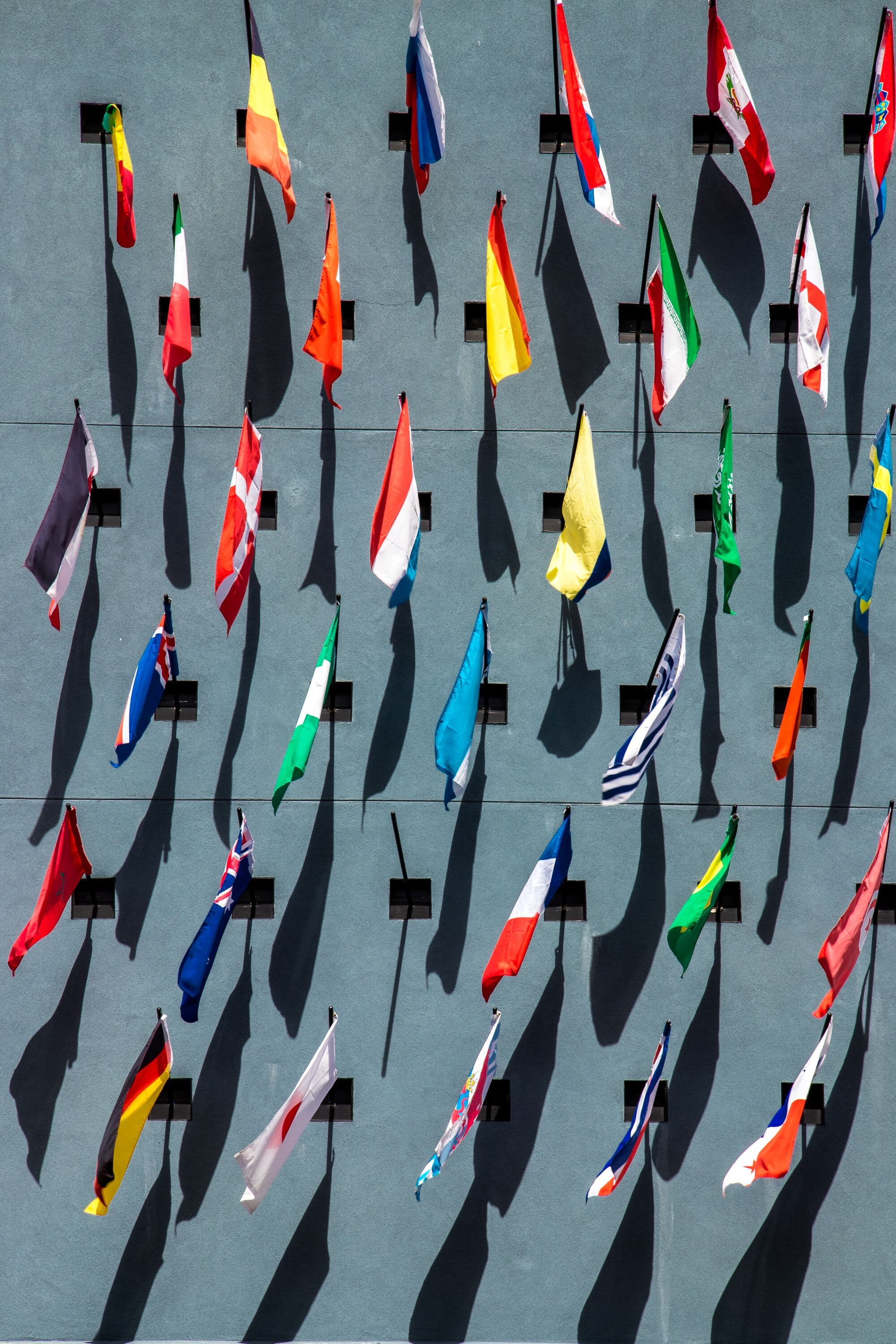
Vexology is the study of flag designs, if you've ever listened to 99 Designs you're probably very aware of what makes a good flag and what doesn't. There are five rules for making a great flag, if you want more details I'd highly recommend watching Roman Mars' excellent TED talk on the matter. View this on the blog → Good stuff eh? So to summarise the rules are: Simplicity: A flag should be simple enough that a child can draw it from memory. Complex designs or intricate details may be difficult to reproduce and recognize from a distance or when the flag is flying. Use of meaningful symbolism: The flag's design should represent meaningful elements, such as the history, culture, values, or geography of the place it represents. Using symbols that have a strong connection to the people and place will make the flag more significant and easier to remember. two-three basic colors: Limit the number of colors used in the flag design to two or three. This ensures that the flag is easily recognizable and visually appealing. Stick to basic colors that contrast well, such as red, white, blue, green, yellow, and black. No lettering or seals: Text, intricate seals, or logos should generally be avoided on flags, as they can be difficult to read or recognize from a distance, especially when the flag is in motion. Instead, use simple, bold shapes and symbols to convey the flag's meaning. Distinctiveness: A flag should be unique and easily distinguishable from other flags. Strive to create a design that sets the flag apart from others, while still adhering to the principles of simplicity, meaningful symbolism, and limited color use. Now that we know what a good flag should look like lets arrive at the point of this post. Enter Melbourne, Australia. The worlds move liveable city from 2012 to 2017, with such famous landmarks as Flinders Street Station, the Melbourne Cricket Ground (MCG), and the Arts Centre. Host of the F1, the Australian Open, and the AFL Grand Final. Home of great coffee, and terrible flags... I know. I know. I know. Like what is going on in this flag? There's a bull, a sheep, a whale, an anvil? All meant to symbolise industries that NO LONGER EXIST IN MELBOURNE. Clearly we're in dire need of an update. For a city that prides itself on art, sports, and culture our flag doesn't represent any of this. We need a new one, and since I'm not a graphic designer (have you seen this website?) I decided to get an AI to build a new flag instead. Inspired by Jacobs's post about using Dalle-2 to generate app logos I'm going to use a very similar methdology to generate a new flag for Melbourne. There are two AIs that I shall be using in this experiment. Dalle-2, and ChatGPT. Dalle-2 is a state-of-the-art (as of 2022) AI for generating images from text. For the technical reader it's what's known as a Gerneral Adversarial Network (GAN) and uses a training database curated by an expert team at OpenAI to ensure the highest quality images are used for generating results. ChatGPT really needs no introduction at this point. When I originally started writing this post last November OpenAI wasn't a household name like it is today. In fact, it wasn't ChatGPT but rather GPT-3 that was making waves in the AI/ML community. When I was thinking about how to describe GPT-3 I had a whole paragraph about neural networks and autoregressive functions but there are many more detailed explainations of the system to I'll link to those instead. The one sentance explainer - ChatGPT/GPT-3|4 are a series of neural networks with a very well catalogued training set that creates a chatbot with "human-like" comprehension. To begin with I started simple, I asked ChatGPT to make a flag for Melbourne. Help me design a flag for Melbourne, Australia. And ChatGPT delivered... Sure, I'd be happy to help you design a flag for Melbourne, Australia! When designing a flag, it's important to consider the history, culture, and symbolism of the city. Here's a suggested design for Melbourne's flag: Design Elements: 1. Shape and size: The flag will be rectangular, with a 1:2 aspect ratio, similar to the Australian national flag. 2. Colors: The flag will feature four main colors - Blue, White, Green, and Gold. These colors represent the natural environment, the city's history, and Australia's national colors. a. Blue: Symbolizing the Yarra River, which runs through Melbourne and played a vital role in the city's development. b. White: Representing the architecture and the heritage of the city, including iconic buildings like Flinders Street Station and the Royal Exhibition Building. c. Green: Representing Melbourne's parks and gardens, such as the Royal Botanic Gardens and the numerous city parks that contribute to Melbourne's title as the "Garden City." d. Gold: Reflecting the importance of the gold rush in Melbourne's history and its significance as Australia's sporting and cultural capital. 3. Layout: The flag will be divided into four equal horizontal stripes, with the top stripe being blue, followed by white, green, and gold at the bottom. 4. Symbol: In the center of the flag, over the white and green stripes, there will be a stylized representation of Melbourne's iconic Flinders Street Station's clock tower. The clock will be set at 6:00 PM, signifying the time when Melbourne was founded. 5. Stars: In the top left corner of the blue stripe, there will be a group of five white stars, representing the Southern Cross constellation. This is a nod to the Australian national flag and symbolizes Melbourne's location in the Southern Hemisphere. By incorporating these elements, the flag will represent Melbourne's rich history, vibrant culture, and its connection to the Australian nation. Pretty good! It understood a lot about what I'm trying to do. In my other experimentation with Large Language Models (LLMs) I've noticed they're pretty good at picking out the main ideas of what I'm trying to do but don't understand some of the specifics. For example, the representation of the clock tower is not something that would work well on a flag, especially having the hands point to a specific time. In fact, I've never heard of this 6pm founding of the city before, I think the AI has become confused somewhere. Anyway, time to make a more specific declaration. Can you refine your first flag design based on the rules of flag design? Of course! Based on the 5 Basic Principles of Flag Design, I can refine the Melbourne flag design as follows: Design Elements: Shape and size: The flag will be rectangular, with a 1:2 aspect ratio, similar to the Australian national flag. Colors: The flag will feature three main colors - Blue, White, and Green. These colors represent the natural environment, the city's history, and Australia's national colors. a. Blue: Symbolizing the Yarra River, which runs through Melbourne and played a vital role in the city's development. b. White: Representing the architecture and the heritage of the city, including iconic buildings like Flinders Street Station and the Royal Exhibition Building. c. Green: Representing Melbourne's parks and gardens, such as the Royal Botanic Gardens and the numerous city parks that contribute to Melbourne's title as the "Garden City." Layout: The flag will be divided into three equal horizontal stripes, with the top stripe being blue, followed by white and green at the bottom. Symbol: In the center of the flag, over the white stripe, there will be a stylized white silhouette of a swan, symbolizing the native black swans that inhabit the region and the Swanston Street, a major city thoroughfare. Stars: In the top left corner of the blue stripe, there will be a group of five white stars, representing the Southern Cross constellation. This is a nod to the Australian national flag and symbolizes Melbourne's location in the Southern Hemisphere. By simplifying the design, using only three colors, and focusing on meaningful symbolism, this refined flag design adheres more closely to the 5 Basic Principles of Flag Design, while still representing Melbourne's rich history, vibrant culture, and connection to the Australian nation. Pretty good, but Swans aren't a major icon of Melbourne. There's a problem with the swans, this is a symbol of Perth, Western Australia, can you think of another symbol? Apologies for the confusion. I understand the need to represent Melbourne uniquely. Instead of the swan, we can use a stylized depiction of a tram, which is an iconic mode of transport in Melbourne and a symbol of the city's modernity and progress. Here's the revised flag design: Design Elements: Shape and size: The flag will be rectangular, with a 1:2 aspect ratio, similar to the Australian national flag. Colors: The flag will feature three main colors - Blue, White, and Green. These colors represent the natural environment, the city's history, and Australia's national colors. a. Blue: Symbolizing the Yarra River, which runs through Melbourne and played a vital role in the city's development. b. White: Representing the architecture and the heritage of the city, including iconic buildings like Flinders Street Station and the Royal Exhibition Building. c. Green: Representing Melbourne's parks and gardens, such as the Royal Botanic Gardens and the numerous city parks that contribute to Melbourne's title as the "Garden City." Layout: The flag will be divided into three equal horizontal stripes, with the top stripe being blue, followed by white and green at the bottom. Symbol: In the center of the flag, over the white stripe, there will be a stylized white silhouette of a tram, symbolizing the iconic mode of transport in Melbourne and representing the city's modernity and progress. Stars: In the top left corner of the blue stripe, there will be a group of five white stars, representing the Southern Cross constellation. This is a nod to the Australian national flag and symbolizes Melbourne's location in the Southern Hemisphere. This revised flag design maintains simplicity, meaningful symbolism, and distinctiveness, while avoiding any confusion with Perth's symbols. Again, it's like it's choosing icons if you did a quick Google search of Melbourne. I don't think a tram is a good symbol, it's too generic, have another go. I apologize if the tram symbol didn't meet your expectations. Let's try another symbol that is more unique to Melbourne – the Federation Square, an iconic public space and architectural landmark in the city. Here's the revised flag design: Design Elements: Shape and size: The flag will be rectangular, with a 1:2 aspect ratio, similar to the Australian national flag. Colors: The flag will feature three main colors - Blue, White, and Green. These colors represent the natural environment, the city's history, and Australia's national colors. a. Blue: Symbolizing the Yarra River, which runs through Melbourne and played a vital role in the city's development. b. White: Representing the architecture and the heritage of the city, including iconic buildings like Flinders Street Station and the Royal Exhibition Building. c. Green: Representing Melbourne's parks and gardens, such as the Royal Botanic Gardens and the numerous city parks that contribute to Melbourne's title as the "Garden City." Layout: The flag will be divided into three equal horizontal stripes, with the top stripe being blue, followed by white and green at the bottom. Symbol: In the center of the flag, over the white stripe, there will be a stylized white silhouette of Federation Square's distinctive geometric shapes, symbolizing the iconic public space and architectural landmark in Melbourne. Stars: In the top left corner of the blue stripe, there will be a group of five white stars, representing the Southern Cross constellation. This is a nod to the Australian national flag and symbolizes Melbourne's location in the Southern Hemisphere. By incorporating the unique and distinctive symbol of Federation Square, this revised flag design aims to represent Melbourne's cultural and architectural identity while adhering to the principles of simplicity, meaningful symbolism, and distinctiveness. Okay third times the charm, I can work with this. Originally I planned to put this prompt into Dalle-2, when I did I didn't get the results I was hoping for. Create a flag for Melbourne, Australia with a 1:2 aspect ratio. Divide the flag into four equal horizontal stripes, with the top stripe being blue, followed by white, green, and gold at the bottom. On the blue stripe, place a group of five white stars in the top left corner, representing the Southern Cross constellation. In the center of the flag, over the white and green stripes. Definetly leaning on the Australian prompt a bit too much. I tried a few other varations of the prompt and I didn't get great results. I've found that while Dalle-2 is a great tool for creating abstract images it's not great at making vector based art like flags and icons when you're looking for very specific components. I also gave Stable Diffusion a try as well and had very similar issues. I think this is going to be one of the main herdles for AI/ML engineers to overcome in the next few years. So I went the manual path and made a flag using the results in Affinity Designer. Like I said at the beginning, I'm not a graphic designer, but at least it doesn't have a sheep on it. So the funny thing is, I went searching for the flags of all the other Australian capital cites, and they're all the same... Not to be outdone by Melbourne, Sydney's flag is arguably worse... much worse. FOUR FLAGS IN ONE?! This flag is bonkers, Sydney, what are you doing! We can fix this. Let's ask our resident designer what they came up with. Certainly, let's create a simplified flag design for Sydney, Australia that adheres to the principles of good flag design: 1. Shape and dimensions: The flag would maintain the width to length ratio of 1:2, consistent with the Australian national flag. 2. Background: The main background color would be a light shade of blue, representing the iconic Sydney Harbor and its beautiful beaches. 3. In the center of the flag: A white, stylized representation of the Sydney Opera House, with its distinctive sail-like roofs, would be placed in the center. The simplified design would retain the sense of the iconic structure while making it easier to recognize and reproduce. 4. Beneath the Opera House: A subtle wave pattern in a slightly darker shade of blue than the background would represent the Sydney Harbour Bridge's role in connecting the city and its people, as well as its position over the water. 5. Bordering the flag: A thin golden-yellow stripe would run along the top and bottom edges of the flag, representing the golden wattle, the Australian national floral emblem. This would provide a touch of color while symbolizing the natural beauty and diversity of Sydney's surrounding landscape. This simplified design eliminates the Union Jack, adheres to the principles of good flag design, and focuses on a few key elements representing Sydney's unique identity. Using me as an interface to draw ChatGPT came up with this flag. Now in terms of flag design I think this fits all the criteria outlined by the North American Vexillological Association (NAVA), but there is something missing, you really can tell this was made by an AI and a software engineer with no design experience. Maybe I should provide some more context to the AI so that the design looks a bit better. Moving onto round three, let's take a look at the sunshine state's capital, Brisbane. Oh yes, that's a flag alright. In fact I think it's six. It does have an interesting symmetry, of all the flags we've seen so far this is probably the best, but it's too complicated. I put the description of the flag into ChatGPT to see what it thought. Thank you for providing the description of the Brisbane city flag. According to the text you've provided, the flag can be described as follows: 1. The flag is divided into six quarters. 2. In three of the six quarters, there are white wavy lines, which may represent either the river that brought commerce and prosperity to the city during early British settlement, or white clouds parting to reveal the blue sky behind them. 3. In these three sections, there are three caducei, which symbolize commerce and trade. These are references to the role of Hermes in Greek mythology as the protector of commerce and trade. 4. The remaining three quarters each contain two Stafford knots and a star. The stars represent the achievements in astronomy of Sir Thomas Brisbane, for whom the city is named. The knots symbolize the 38th Foot (Staffordshire Regiment), which Brisbane served in prior to being named governor of the colony of New South Wales. 5. The flag features many maritime symbols, reflecting Brisbane's early role as a river port. This description provides a comprehensive understanding of the symbols and elements that make up the flag of the City of Brisbane. So now that ChatGPT knows what the flag looks like, what's its opinion of it? If you ask ChatGPT for an opinion it will tell you how as an AI it can't have any opinions. But if you ask it to rank based on a criteria it becomes much more helpful. While I am an AI language model and my opinions are based on the information and patterns available in my training data, I can analyze the flag of Brisbane based on the principles of good flag design: 1. Simplicity: The Brisbane flag is divided into six quarters, each with distinct elements, which might make it challenging for a child to draw from memory. However, the overall design is not overly complicated. 2. Use of meaningful symbolism: The flag of Brisbane has meaningful symbolism, representing the city's history, commerce, Sir Thomas Brisbane's achievements in astronomy, and the Staffordshire Regiment. The symbolism appears to be well thought out and relevant. 3. 2–3 basic colors: The flag seems to primarily use three colors (blue, white, and possibly yellow or gold for the caducei). The color contrast is effective, and the design adheres to the basic rules of color theory. 4. No lettering or seals: The flag does not contain any lettering, seals, or complex emblems, which is in line with the principles of good flag design. 5. Distinctiveness: The flag's design is unique and appears to be distinguishable from other flags. The combination of elements and colors makes it stand out as a symbol of the City of Brisbane. While the Brisbane flag's design may not be the simplest, it does follow the other principles of good flag design well. Overall, it can be considered a reasonably well-designed flag with meaningful symbolism and a unique appearance. Well that's a pretty good breakdown of the flag, now what does it think we should do to fix it? As an AI language model, I don't have personal preferences, but I can suggest some potential changes to the Brisbane flag based on the principles of good flag design. The main area of improvement seems to be simplicity, while maintaining the meaningful symbolism and distinctiveness of the flag. Here's a possible approach: 1. Simplify the design: Instead of dividing the flag into six quarters, you could choose a simpler layout, such as horizontal or vertical stripes. For example, you could have three horizontal stripes with colors representing the river (or sky), commerce, and Brisbane's achievements in astronomy. 2. Incorporate meaningful symbols: Retain key symbols that represent important aspects of Brisbane's history and culture. For instance, you could place a single caduceus in the center of the flag to symbolize commerce, and a single star to represent Sir Thomas Brisbane's achievements in astronomy. 3. Maintain the color scheme: Keep the existing color scheme of blue, white, and possibly yellow or gold for the caduceus. These colors provide good contrast and adhere to the basic rules of color theory. 4. Avoid lettering and seals: Continue to follow the principle of not using any lettering, seals, or complex emblems. 5. Ensure distinctiveness: With a simpler layout and the inclusion of meaningful symbols, the flag should remain distinct and easily recognizable as representing the City of Brisbane. Please note that these suggestions are only meant as a starting point for discussion and are based on the principles of good flag design. The final design should take into consideration the opinions and preferences of the people of Brisbane, as well as the city's unique history and cultural identity. These are some pretty good ideas, let's get back to Designer to finish the job. Not too bad if I say so myself. The design recommended by ChatGPT is simpler and maintains the core symbolysm - literally using the same Caduceus. Also fun fact: the Caduceus seen on the OFFICIAL flag of the city of Brisbane is the one found on wikipedia! I'm going to say that redesign was a success. While using the same colours and symbols ChatGPT has reconfigured the flag into something more flag-like for the citizens of Australia's sunniest capital. Now onto the most "rad" city in Australia... Oh (Rad)Adelaide, where the shops close at 4:30 and the city is surrounded by an impenetrable wall of gardens. I thought you were better then this. I really like the whole "can I borrow your homework" vibe I'm getting between the Melbourne and Adelaide flag. Let's have a go at this one. For this flag I asked ChatGPT to pretend it was someone from NAVA. Now pretend you are a member of the north american vexillological association and you have been asked by the mayor of Adelaide to submit a design for a new flag, what would you make? As a member of the North American Vexillological Association, I would create a design for the new flag of Adelaide that is both visually appealing and representative of the city's unique characteristics and values. Here's a proposed design: 1. Layout: A horizontal tricolor flag divided into three equal bands. 2. Color Scheme: - Top band: Navy blue, representing the Gulf St Vincent and the importance of the coast to Adelaide's identity and economy. - Middle band: Golden yellow, symbolizing the sunny climate, beaches, and the wine industry in the surrounding region. - Bottom band: Green, representing the Adelaide Plains, the Mount Lofty Ranges, and the city's commitment to preserving its natural environment. 3. Emblem: In the center of the flag, place a stylized white silhouette of a grid-like city layout, referencing Colonel William Light's planned design of Adelaide. This design can also be interpreted as a nod to the "City of Churches" moniker, with the grid pattern resembling a cross. 4. Star: Above the city layout emblem, a white seven-pointed star (also known as the Federation Star or Commonwealth Star) is added, representing Australia's states and territories, and Adelaide's role as the capital of South Australia. This design incorporates elements of Adelaide's geography, history, and culture, creating a distinctive flag that residents can be proud of. By adhering to the principles of good flag design, the proposed flag is simple, meaningful, and easily recognizable, making it suitable for various uses and contexts. This is quite a good set of instructions, my best attempt at creating the flag looks like this. I think it's quite unique. The colour scheme and design is something I haven't seen on a flag in Australia before. It would stand out quite well in the Adelaide city center. Lastly, we travel to the other end of the country, the most isolated captial city in the world, Perth. So I actually think there's not too much of a need to change the flag of Perth, it's pretty good, if not a bit generic with the cross of St. George and the seal of Perth, which is the only real big no-no. But the black swan is a very symbolic and famous representation of Perth. For this flag I only asked ChatGPT to modify the current flag. Apologies for the confusion, and thank you for the information on the current flag of Perth. Based on this information, I can suggest a new design that incorporates elements from the existing flag while still emphasizing the unique features of Perth: Shape and size: The flag maintains a standard rectangular shape, with a 2:3 aspect ratio. Color scheme: The new design retains the red and white colors from the St. George Cross, and introduces blue, yellow, and green to represent the sky, sun, and land, respectively. Elements: a. St. George Cross: The flag's background features the red St. George Cross on a white field, preserving the existing design and acknowledging Perth's British heritage. b. Yellow sun: Within the blue field, a yellow sun with twelve rays represents the city's sunny weather and its nickname, "The City of Light." e. Crowned black swan: A black swan wearing a crown around their necks from the city's seal are placed within the center of the St. George Cross. The swan symbolizes the Swan River and pays tribute to Perth's indigenous heritage. Design layout: The St. George Cross fills the flag, The crowned black swan is centered within the St. George Cross. This updated flag design for Perth combines elements from the existing flag with new features that showcase the city's natural beauty, sunny climate, and rich history, creating a more distinct and meaningful symbol for the Western Australian capital. Okay not so much different from the current flag, I did have to provide a bit of prodding to get this suggestion. An elegant design for an elegant city. I'm not entirely satisifed with the answers that ChatGPT gave and I can't really put my finger on why. So what can we learn from all of these? I think the most interesting point I take away from this little exercise is how close the AI gets the designs to being what I would consider great but just misses out. I think it all comes down to context. The AI doesn't have an opinion about what looks good and what doesn't, the human mind is quite good at noticing small details which ChatGPT can't. The responses are all very generic. Which makes some sence, a flag is a flag, unless you're Ohio, or Nepal all flags pretty much look the same. I think this confuses ChatGPT because going back to context, the algorithm doesn't have an understanding of what goes into a flag to make it look good. I think this experiment shows exactly why people are both horrified and apathetic to the advancements that are happening in AI. These AIs are really good at getting to a baseline level of skill that anyone might be able to do with a few hours/days of training, something like 80% of what an expert can do. But the final 20% which can take months, or even years for a person to accomplish is still out of reach for even the most advanced general AIs. I guess we'll have to wait for GPT-5 to see if AI can reach the final 20%.